One Stock Chart pattern to avoid
The purpose of this post is to tell you about one technical trading pattern I avoid putting my hard-earned capital towards. What do you like to do in your free time? One of my free time activities is to look at stock chart patterns. I call this hobby ‘graphs for laughs’. I believe if you become familiar with a number of basic patterns you will have the ability to pick stocks better. It is all about pattern recognition.
I am not longer a big believer in looking at every technical pattern iteration like they are a sign or has a meaning. Rather I am looking more broadly for a trend in relation to a moving average. Then I subsequently confirm if my prediction, based on my reading of the tea leaves, I mean stock trading charts, was correct.
Instead of learning every trading pattern from the “cup and saucer” to “Fibonacci retracements”, I would rather become a specialist at simply looking at the stock price trend in relation to the moving average. That is being good at recognizing patterns of basic technical analysis, the subtle over the exotic.
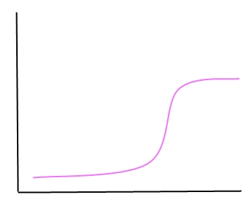
This is one trading pattern I avoid. I do not know what other technical traders call it or what they recommend. However, in my experience, it is not to be traded. I call it the snake.
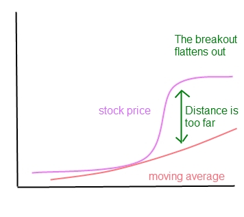
This is a stock that has moved up rather rapidly. It does not matter the time frame. It could have been for many months or even a few weeks. However, once it makes the initial move, the curve flattens out.
The reason this technical pattern tricks people is:
- The moving average is usually still be increasing.
- The price has not broken down below the trend line.
- The fundamentals are usually good.
- It comes up as a ‘buy’ on many quantitative screens.

But still every time I have traded this stock I have not had a good experience.
The reason this technical pattern does not perform well is it has moved too far from the moving average trend line
What is happening is it has made a positive move because of some valuation, and then it hits resistance above the moving average. This is because many of the traders want out. Traders take profits and it hits a plateau. All these guys need to exit before it as any potential to move up again. In simpler terms the moving average needs to catch up to the price, it is overbought. These equities often move to highs above the moving average line, and then come back closer with a correction.
This stock will come upon stock screens as a recommended buy. This is why I have seen it so many times. This is because the software to pick stocks will see price momentum as positive, and the fact that it is trading above moving average. However, many stock trading software (not all) have a hard time recognizing patterns like a human.

Now people can argue, Bollinger bands etc would tell you this anyway. But like I said at the start, I know simple moving averages work. I try not to get too complicated with every type of technical indicator or exotic pattern. This is because the marginal benefit of using complicated investment tools or examining the granularity of a pattern is small. Time could be better used studying something else.
My conclusion is if you want to make money in stocks by trading stocks on technical patterns, it is best to avoid this pattern.
Leave a Reply